Bubble’s new responsive engine is out and it integrates CSS flexbox design principles with the editor. What this means is that this feature is now available by default on every plan, free or paid. It introduces new features which make designing your bubble application easier and more convenient. You don’t have to struggle in creating pixel-perfect structures for your applications. We will go through each of the important features in this article.
The new responsive engine makes it very easy to structure your bubble applications, instead of giving you the freedom of dragging and dropping elements anywhere on the screen, it makes you place the elements in a preset of formats. At first, it may feel restrictive when coming from the old engine but as you spend more time on the new engine it does feel better and faster to make applications with it. Some important features of the new engine are :
We will go through each of these features in detail.
There are 4 types of container layouts in the new responsive engine. Each with its usage scenarios, a layout can be fixed, row, column, or align to the parent.
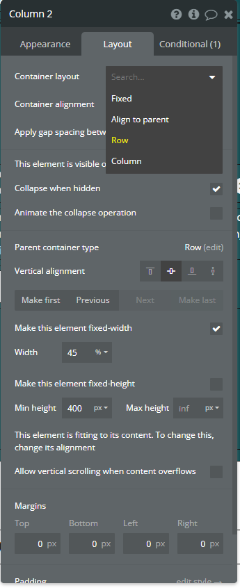
Fixed:
In a fixed container you are free to drag and drop elements as you would in the old engine, all the alignment and spacing you do in this container is manual and if you use this layout, it would be tricky to get the responsiveness you need for the web application.

Row:
In the Row layout any element you place will take its position horizontally and align itself automatically to the previous element. This is particularly useful when you want to create a header or footer for your web application, where all the text, buttons, etc. need to be aligned next to each other.

While using a row layout, you can choose how to space the individual elements. You can choose left-aligned, centered, right-aligned, space around, and space between to get the look of the structure you want.

To reposition an element you have already placed, you can select it and reposition it using the options that are given.

Column:
In the Container layout any element you place will take its position below or above the already placed element. This configuration can be useful when you are creating a sidebar for example and want all the elements to be aligned vertically.
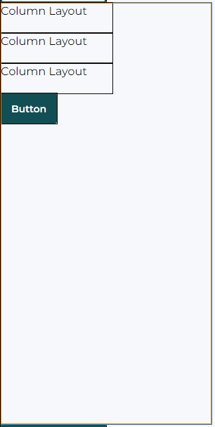
Column layout also gives you the freedom to position the elements in any sequence you want just like the row layout. You can position the elements in top-aligned, centered, bottom-aligned, space around, or space between.

Align to Parent:
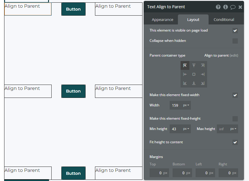
Align to Parent gives you the freedom to place the elements in any nine positions. Align to parent is useful when you want to place elements at a particular position that cannot be achieved with a row or column layout.
Repeating Groups:
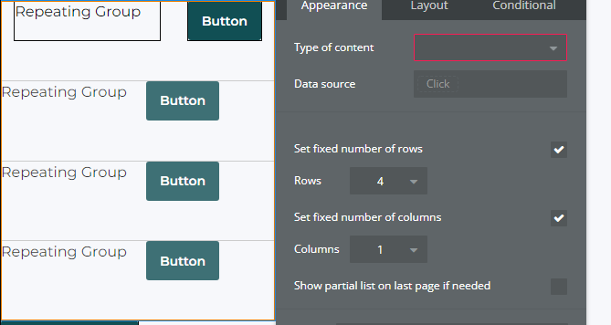
Repeating groups also give us some new options in the new responsive engine. Repeating group cells can also be given the layout of fixed, row, column, and align to parent. In addition to this, you can fix the number of rows and columns you want in the repeating group. You can choose the scrolling option of the repeating group to be either vertical or horizontal.
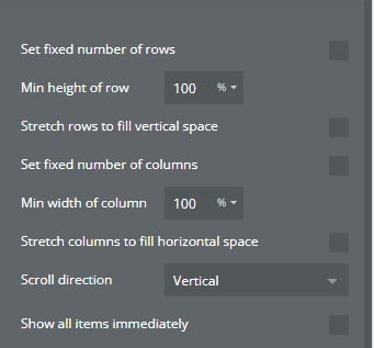
To make a repeating group scrollable, uncheck the fixed number of rows and columns. Give the row a min height of 100% and set the min-width of 100% as well. Now you can choose the scroll direction of the repeating group, either vertical or horizontal. Experiment with different percentages of height and width to get your desired layout.
Margins:
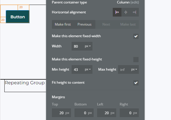
A margin is a space that is around an element’s border. In the new responsive engine when we need to put some space between two elements we can achieve that space by adding proper margins between them. You can add margins to elements top, bottom, left, and right.
Padding:
Padding is the space between an element’s border and its content. We can apply padding to an element’s inner content the same way we can add margins. We have options to add padding to the top, bottom, left, and right.

Widths & Heights:
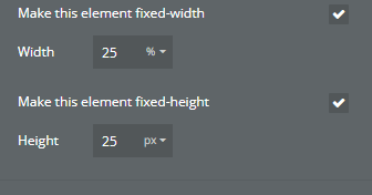
A new way to set widths and heights in the new responsive engine is by using percentages instead of pixels like we normally do. We can make the element fixed in width and height if we want its size to remain the same on any screen size.
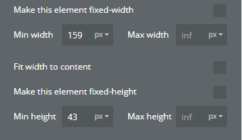
If we want an element to adjust its width and height dynamically as the page’s height and width change we can give it a min-height and min-width in percentage. For the max height and width, we leave it to infinity so that the element automatically adjusts its height and width.
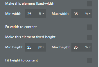
We can also give a minimum and maximum height and width to the element, by doing this we restrict the element not to contract more than the specified min-height or width and also not to expand more than the specified max height or width respectively.
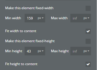
If we want to keep the height and the width of the element to fit the content we provide, we can just check the fit height to content and fit width to content boxes. This is particularly useful when you want to display dynamic text with dynamic characters being displayed.
Example of Responsiveness:
To sum it all up here is an example of how to set up your groups for responsiveness.
1. First, we create a page and set its dimensions, you can choose whatever height and width you like, but make sure the page layout is set to the column.
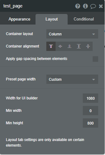
2. Next, we create the main group which will hold all our groups inside it. Set this group’s layout to be Row and give it a min-width of 100% and min height of 350px, leave the max width and height to be infinity.

3. Now we will create the subgroups to be placed inside the main group. Set the container layout to row, give the group a min-width of 25% and min height of 250px, and set the max width and height to infinity. Set the vertical alignment to the center. Give the group a border color as well.

4. Add a Text Element inside the subgroup and set its min width to 50px and min-height to 20px, check the fit width to the content option, and leave the max width and height to infinity. After this just copy and paste the sub-group to create a total of four subgroups inside the main group.

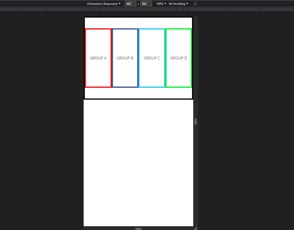
5. This is how the final groups should look like, you can change the border colors to what you want, and now all you have to do is check the responsiveness. Preview the page and inspect the page. Now click the responsiveness in the Dimensions and drag the slider and watch the groups behave dynamically as you increase and decrease the width.

